NFVbench Kibana visualization: overview
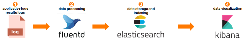
The fluentd integration offers the possibility to use elasticsearch and kibana as a visualization chain.
Chain overview:
Example of NFVbench visualizations
Kibana offers a lot of visualization type (line and bar charts, pie, time series chart, data table …) and also provide a plugin to develop graph using Vega.
In the below examples, visualizations are based on an NDR result and are developed using Vega-lite.
Data are aggregated using user_label and flow_count properties.
In kibana/visualizations/ pre-created graphs are available into json files.
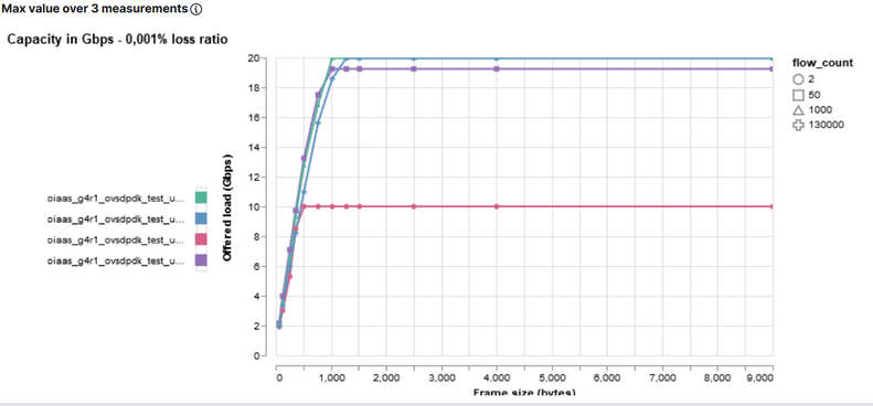
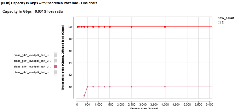
For NDR capacity in Gbps using line chart, the offered load in Gbps (offered_tx_rate_bps) is used and only the maximum value of the aggregation is kept.
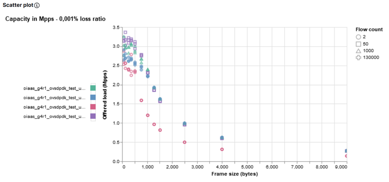
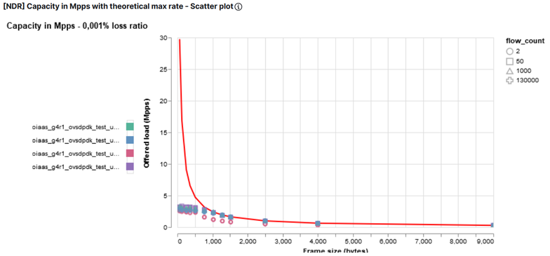
For NDR capacity in Mpps using line chart, the actual TX rate is used (rate_pps) and only the maximum value of the aggregation is kept.
Scatter plot graphs use the same values but keep all values instead of keeping maximum.
Example of a line chart:
Example of a scatter plot chart:
Vega offers the possibility to add another graph as a new layer of current graph.
This solution is used to combine NFVbench results and theoretical line rate.
Using extra_encapsulation_bytes in –user-info property (see User info data section),
the theoretical max value (for bps and pps) will be calculated and can be used in graph through theoretical_tx_rate_bps and theoretical_tx_rate_pps properties.
Example of chart with theoretical value (red line):
Each Vega graph can be moved, zoomed (using mouse scroll) and one set of data can be selected.
Example:
These visualizations are included into Kibana dashboard for a synthesis of one set of result (i.e. same user_label value) or for comparison (i.e. a selection of user_label values).
See Kibana user guide: Filter dashboards and visualizations for more details about user_label selection.
All these visualizations and dashboards are saved into the export.ndjson file and can be imported in an existing Kibana. See Import Kibana dashboards and visualization.
Import Kibana dashboards and visualization
To import Kibana dashboard and visualization:
curl -X POST localhost:5601/api/saved_objects/_import -H "kbn-xsrf: true" --form file=@export.ndjson
Note
.kibana index must exists in elasticsearch.
Note
.kibana index is created automatically after a first deployment and configuration of Kibana.
Kibana user guide: Filter dashboards and visualizations
Filter Kibana dashboard or visualization using Kibana query language (KQL)
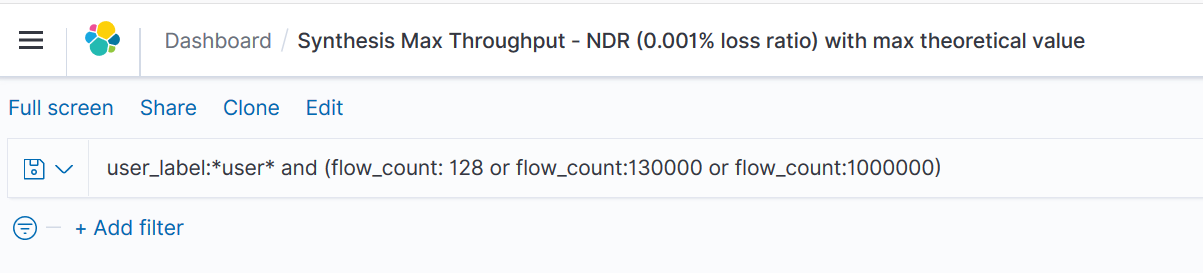
user_label:*demo* and (flow_count: 128 or flow_count:130000 or flow_count:1000000)
Note
This query will filter all user label which contains demo in the value and filter 3 flow count (128, 130k, 1M).
Note
flow_count is a number so KQL query can not contain formatted string.
Example:
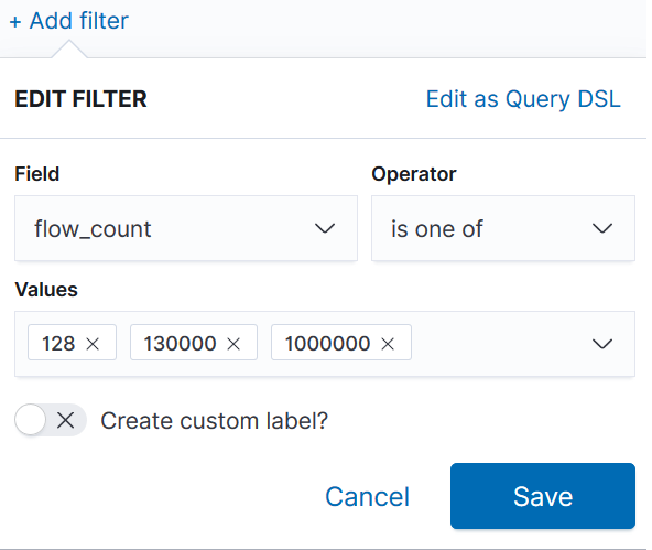
Filter Kibana dashboard or visualization using Kibana filters
Kibana offers the possibility to add filter by selecting field and operator (is, is not, is one of, is not one of, exists, does not exist).
Example: